TL;DR
- Google Data Studio can and should make everyone’s lives easier.
- Utilizing Google Data Studio Gauges can speed up high-level reporting.
- Use this process to create temperature checks for any metric/KPI you report on.
Google Data Studio is one of the handiest tools for anyone looking to report their data. It is very intuitive and from my experience, pretty limitless. There is a great community that is constantly coming up with new and better ways to visualize data for strategic decisions. There is no one perfect way to set up a dashboard, it all depends on goals, audience and reporting cadence. One way I like to report to higher-ups that have limited time is to utilize gauges in Google Data Studio. This is a newish community visualization that can be really handy to show quick wins (or losses) in a really digestible format. Use this free template and process to get started with Google Data Studio gauges.
Google Data Studio Gauge Setup
The report linked above can help you get started utilizing gauges in your Google Data Studio Reports.
Step 1: Add Gauge From Community Visualizations
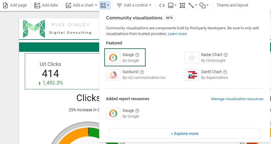
Like any other field, this will add it with no data associated. We will want to create a blended data source so we can compare two-time frames. In this example, I use Year To Date vs. the same time frame the previous year.
Step 2: Blend Data
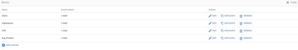
To do this you will want to go to Resource –> Manage Blends. You will then hit Add A Blend.
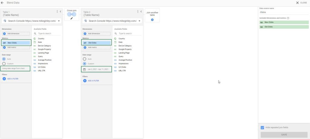
In this example, I use Google Search Console data, but any data source can utilize this process.
- Choose whatever data source you want to utilize at the top.
- No need to select the dimension with Cross-Join (it will combine all possible combos between tables).
- Choose your Metric (Clicks) for both tables.
- Change the name for one of them to New [Metric] and the other to Old [Metric].
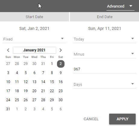
- For the Old [Metric] table, change the time frame you want to compare against (below for the YTD numbers).
- Name the Blend in the top right.
- Save in the bottom right.
Step 3: Add Blended Data To Gauge Field
Select the gauge and on the right rail, we will get to work.
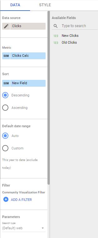
- Change the Data Source to the one you just created.
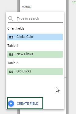
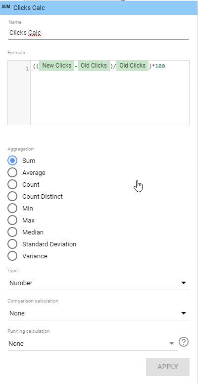
- Create a new Metric with this formula:
- ((New [Metric]-Old [Metric])/Old [Metric])*100
- Hit Apply
Step 4: Style Gauge
In the right rail at the top, there is a Style field.
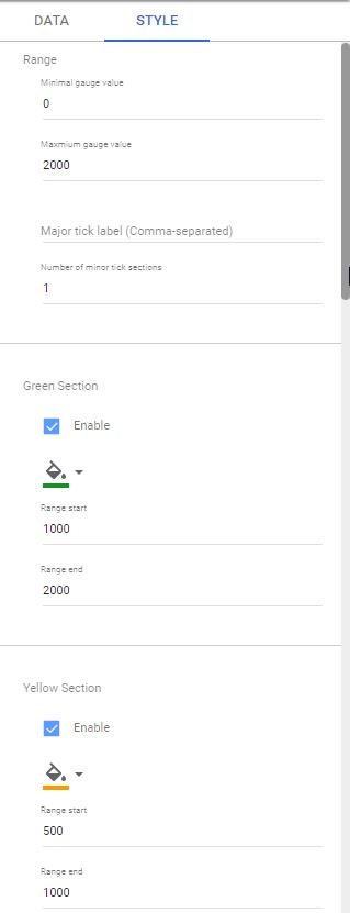
Here you can select the ranges for your gauge. You will want to create realistic ranges to get the most out of this report.
- Range should cast a wide net to make sure your reporting stays within the chart.
- Green, Yellow and Red sections should be made by you with acceptable ranges that you consider to be successful, ok and bad.
- The chart will change in real-time so there is no need to save, you will be good to go here!
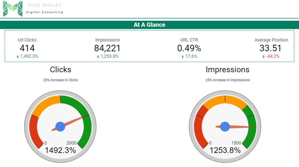
How To Use This Report
This can serve as a very high-level report to just take a temperature check on how you are doing. You will not be able to get too many insights from this besides are we doing good, bad, or ‘oh crap’. I like to add our goal above the gauge to keep us honest, just a simple text box. The way I like to structure my reports is by having these as the first sheet. If anyone is going to look at anything I want them to see this to see how we are doing. From there if they want, they can dig into more detailed data that I and many others have written processes about.
There are many ways to structure these so I encourage you to try them out. Dig deeper into Google Data Studio to find ways to make your life easier.
How I Help?
I am mainly using this site as a portfolio to create content that can help others in the industry. I have learned so much from people in this field and I want to do my part to help as well. I will continue to create processes and free templates that can hopefully help anyone in SEO and Digital Marketing. If there is anything you are looking for or have questions about please reach out to me on my Contact page or on Twitter!
Who To Follow
Interesting/smart accounts you should be following on Twitter: